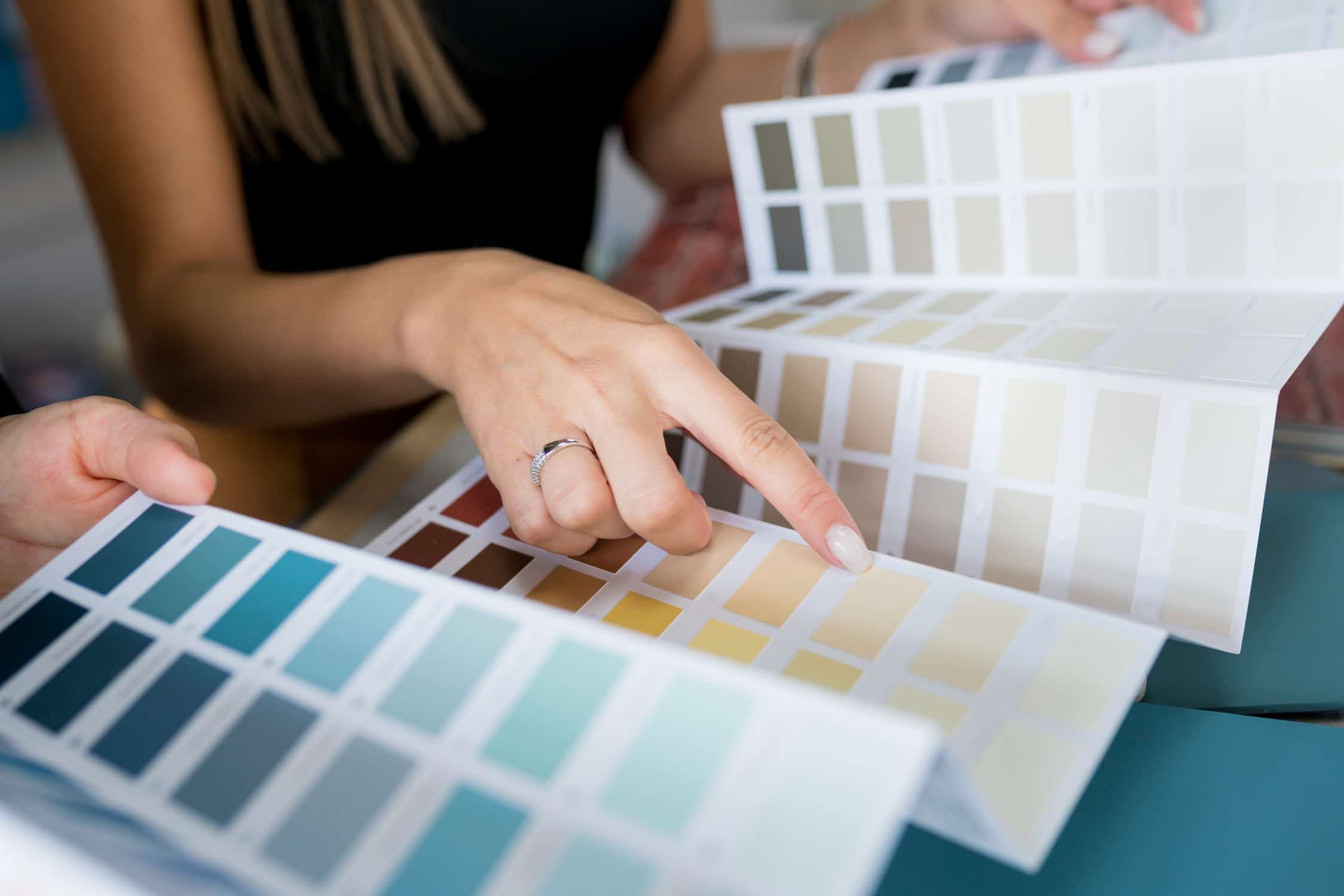
Color is a potent tool that profoundly influences human perception and behavior. Retail, restaurants, healthcare, education, and hospitality industries strategically deploy color to shape experiences, attract clientele, and achieve organizational goals.
Role of Color Psychology
In customer-facing scenarios, strategic color choices play a pivotal role. Whether it’s attracting clients, alleviating anxieties, establishing branding, guiding traffic flow, or highlighting products, colors are powerful tools. For example, hotels use deep hues to convey luxury, schools employ cool tones for better focus, healthcare facilities opt for relaxing pastels, and retailers energize spaces with vibrant accent walls.
But it doesn’t stop there. Colors also significantly influence employee experiences, affecting workplace satisfaction, energy levels, morale, and creativity. Vibrant colors can foster lively collaboration, but balance is key to avoiding overstimulation. The strategic alternation between intense and muted color zones gives employees a sense of control over their workspace.
So, whether you’re designing for customers or creating a motivating work environment, understanding and leveraging color psychology tailored to specific industries is a powerful tool for success.
Retail Spaces – Driving Sales Through Color
- Inviting Store Atmosphere: Warm neutrals like beige, taupe, and gray establish a welcoming foundation, while pops of vibrant accent colors engage and captivate shoppers.
- Showcasing Products: Neutral backgrounds prevent distractions, allowing brightly colored merchandise to take center stage. Complementary accent walls highlight featured collections.
- Brand Identity: A restrained use of signature brand colors provides a visual identity without overwhelming neutral spaces, ensuring brand recognition.
- Increased Transactions: Strategic color combinations, such as calming blues and optimistic yellows, guide shoppers through an environment designed for meaningful purchases.
Restaurants – Stimulating the Senses
- Increasing Appetite: Reds, oranges, and yellows create appetizing environments, while darker shades convey elegance and refinement.
- Establishing Intimacy: Deeper, warmer paint colors in dining areas foster coziness and romance, while brighter hues in lounge spaces encourage socialization.
- Managing Flow: Distinct color schemes define different zones, aiding in traffic management and creating a cohesive dining experience.
- Uplifting Staff Energies: Invigorating colors in workplace areas boost morale, while a careful balance avoids overstimulation and anxiety.
Healthcare Settings – Creating Calmness
- Soothing Atmosphere: Cool blue and green tones, complemented by warm wood trims, establish an atmosphere of trust, security, and tranquility.
- Wayfinding: Distinct color codes simplify navigation, ensuring ease of wayfinding within departments and floors.
- Reduced Patient Anxiety: Soft pastels and calming tones help relax patients, while vibrant contrasts draw attention to essential information.
- Improved Caregiver Focus: Peppy yet calming colors in caregiver stations enhance concentration, communication, and overall morale.
Education Environments – Supporting Learning
- Improved Concentration: Cool greens, blues, and grays in classrooms promote focus, while warm accents create an inviting energy.
- Creative Engagement: Teachers’ lounges with invigorating colors foster innovation, and vibrant secondary hues in art rooms inspire creativity.
- Behavior Management: Subdued tones in waiting areas minimize restlessness, contributing to a calm and focused educational environment.
- Inclusive Culture: Brightly colored murals in hallways and cafeterias promote school spirit, with varied tones accommodating diverse sensibilities.
Hospitality Design – Evoking Indulgence
- Luxurious Indulgence: Saturated jewel tones, metallic sheens, and deep hues convey opulence in guest rooms and ballrooms. Gold and cream accents suggest extravagance.
- Calm Comfort: Warm grays, taupes, and mocha browns establish welcoming foundations in lobby and lounge spaces, allowing focal points to shine.
- Social Energy: Vibrant colors in restaurants and bars create lively atmospheres conducive to conversation and celebration. Muted dining areas allow selected colors to make a striking impact.
- Intuitive Wayfinding: Distinct color schemes for each floor, coupled with signage in signature brand shades, simplify navigation, enhancing the overall guest experience.
In essence, the strategic use of color is a transformative tool that can elevate your business, creating spaces that resonate with your audience and contribute to the achievement of your organizational goals. For expert color consultation and transformative painting services, contact Dave Cole Decorators today.
Ready to unlock your business’s potential through strategic colors? Dave Cole Decorators offers full-service interior and exterior commercial painting incorporating psychology-backed schemes designed to further your goals. Contact us at 616-303-5911 for a FREE consultation from our color psychology experts on selecting palettes to attract more customers!


